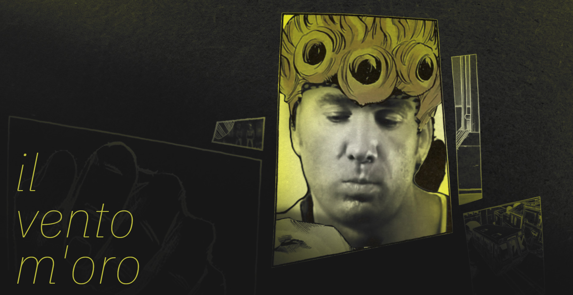
IWF has been quite the journey: lots of friends, lots of dedication, and lots of self-reflection. I went from being indifferent about Gachi, to thinking it’s the greatest thing ever, to hating the genre as a whole and running away from my part, to ultimately coming back and feeling indifferent again. But instead of focusing on my jumbled perception of what this stuff means to me, I’d like to kick off this website with some insights on the process of visualmaking and a shot-by-shot commentary of the part I worked on, Giorno’s theme, primarily geared towards newcomers.
Background
Whether our intro to this stuff originated from classic 音MADs of the 2000s or the zoomer YTPMVs of today, I believe every creator’s initial spark of inspiration comes from asking the same question:
what effect is this
The mere ability to speed up and slow down our favorite characters, to chop up their words and make them say whatever we want, or to mask out their backgrounds and put them in a 3D world excites us, and our initial enjoyment comes from learning the coolest, newest tricks. Every new effect and technique liberates us higher, but as I’m sure many of you intermediate users know, just as we get comfortable using the software and feel like we can do anything, we hit the ceiling to the sky we thought was infinite.
We realize there’s more to this world than just plugins and Video Copilot footage, and our assessment of value shifts from technical skill1 to concepts we never even knew existed. Composition. Leading the eye. Purpose. My shift in thinking started around 2019, when I got addicted to BBクッキー☆劇場 videos. I won’t try to explain the insanity of the クッキー☆ 界隈 and the 淫夢厨, but essentially what I appreciated was the lengths people were willing to take to tell cohesive narratives out of more or less children’s playtoys. “Telling a concrete story” became my new definition of a “successful” 音MAD, and I was eager to put this new mindset to the test on the first major project I got to work on, The Power of Terry
The main part I did was Gangplank Galleon, and as you may recall if you watched the collab at full speed like a normal person, it ended up kinda being a huge mess. I came up with this ridiculously convoluted story that sounded solid for a BB劇場 video, but was not meant for something that’s 50 seconds long that’s supposed to follow a rhythm. The part had some cool moments sprinkled in the chaos and definitely succeeded in imitating my favorite creator2 at the time, but evaluating it made me realize my approach to imagemaking was entirely wrong. I was right in that the “story” is the driving force of good work, but I learned that the mood is far more important than the logic of each shot. I was so obsessed with trying to make every detail and action in my work perfectly fit this sequence of “A causes B causes C,” that I never even considered how my audience would feel during each moment, outside of whether they “get what’s happening.”
It’s possible to build interest and convey ideas without ever showing a concrete “thing” happening, solely by changing elements like color, shape, and scale. Take this Oddfellows piece for example.3 Muting the audio it’s literally just a bunch of shapes bouncing around, yet you can still tell each shot was made with a purpose. The elements of design are added and subtracted to create peaks and valleys of interest, like how we get sprinkles of color in :20 and sprinkles of 3D in :40. When the “climax” happens past :50, 3D and color take the spotlight, and ideas like the rectangles are re-imagined as curves. Listening to the voice narration it’s pretty obvious why they make their design choices, but as you’ll see in the commentary, we can be much more subtle in how we convey concepts.
Main Overview
In essence, the main idea of the Jojo part can be summarized as follows:
Playing with the intersection of comics and animation while depicting specific moments from Jojo
Comics are actually pretty insane when you compare them to animation. They lack the fourth dimension of time, they lack color (mostly), they lack sound, and yet they can still suspend our disbelief to the same degree as a film that has these elements. So when one is thinking about converting manga into animation, their first intuition is often to extract what they want, the characters, from manga’s limitations into the world of film. They’ll free the artwork from the bounds of the panels and warp various features of the hair or limbs over time to explicitly show movement that was once only implied, decorating their new world with the various devices of film like lens flares, color correction, and particles.
Essentially what I want to do is the opposite. I want to take these live action characters and introduce the limitations of manga, stripping them of their motion and confining them to a world of panels. Now that doesn’t mean I have to remove all motion and follow manga panel convention exactly–a pitfall most traditional “comic book parts” in collabs fall into–I just need to balance them. In the same way AMV makers now have to fit their B6-size pages into the 16:9 screen, we now have to fit these static panels and images into the kinetic world of motion design, and more importantly, the tension of the audio.
It can’t be understated how important the audio is to 音MAD. After coming out of this collab I’m now convinced that it’s easily twice as important as the visuals; the majority of the choices of what I show on screen, what mood I try to convey, what animations are shown, are all at least indirectly influenced by Terrio’s thought process and how the audio sounded because of it.4 As with the two parts in TPOT I did, the audio was already pretty fleshed out by the time I joined, and I didn’t have any problems fitting its mould. It’s definitely my favorite audio I’ve worked on of the three, for reasons you’ll see below.
Technical Bits
For the completely uninitiated, the two programs I used for pretty much the whole project were After Effects and Photoshop. I temporarily used Blender for a few of the shots, but eventually I moved them all into AE. No plugins were used, outside of maybe a bit of murasin’s halftone.
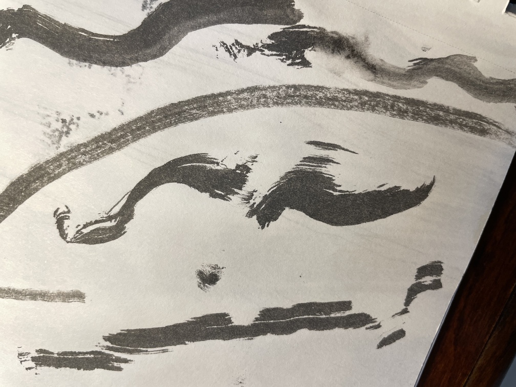
Most of the textures are actually my own; I spent probably twelve hours total taking pictures of textures from my physical Jojo manga collection5 and a bunch of ink splotches I made on paper, tagging them with Hydrus for easy lookup.

I tended to work on the project in waves, where the first half was ahead of the second. Ultimately I left the second half fairly underdeveloped in comparison to the first, as you’ll see in the commentary.
Shot-by-shot Commentary
Here’s a crazy overlay of all the different versions this part went through (yt upload if you want to save me some bandwidth) over its eleven month development. Adjust speed as necessary. They aren’t arranged chronologically, and not all spots represent the same point in time, but it’s not that hard to guess what came first when you compare them. The two on the top right are Terrio’s OG storyboard (right) and my first semblance of the visuals (left).

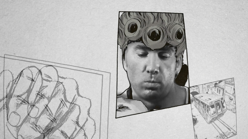
The Sailor Moon part actually was one of the first parts finished, so what I had to work with for the beginning transition was already decided. It was pretty tough thinking of how to use that lone moon in the center of the screen until I remembered the coin used in the eyecatcher for the anime. Looking back I could’ve added the silver layer and maybe even spun the coin to make the reference clearer, but I also wanted it to function as the sketchy red inner cover of the manga.

Despite this being a part about comic books I barely touch on the idea of pages of paper itself. You’d think I’d use this page flip transition more often, but I only use it again once. Part of this was to not be too cliche and repetitive, but the bigger reason is that I felt I’d lose the “immersion.” Y’know it’d be cool to back up and show the panels as actual books and magazines with the pages flipping wildly in 3D, but I didn’t want to suggest this world all takes place on these small sheets of paper the viewer is just holding in their hand.
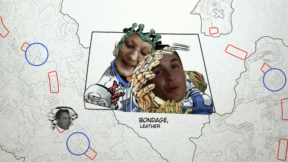
Right off the bat I jump in with a bit of excitement with the panels popping onto the screen in scale, riding off of the percussion bridge6 between the two parts. I deliberately keep the camera stationary until the main medley kicks in to reinforce the sense of “loading” between the sections and also to make the animations easier to parse. A keen viewer will notice that another thing changes when the camera starts moving: the color.
You can feel Terrio’s intention to treat this beginning sequence like a buildup to the “main story” in the slight compression of the vocals up until the drop at the Gay Mafia line. This is what primarily influenced me to style this entire section after the “traditional” way manga is read, on physical sheets of cheap, black-and-white magazine newsprint with a hint of yellow to suggest aging or sunlight.7

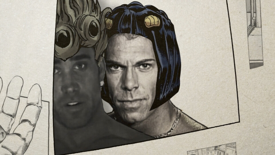
There was actually a point where I considered abandoning the black-and-white idea altogether in order to make Aniki’s hair blonde and Kazuya’s hair blue so that the viewer makes the connection to Giorno and Bucciarati immediately, but after Grunku suggested I bring it back, I realized I could color just the hair and make the read even stronger, which I was happy about. If you look closely there’s also an ever so slight amount of saturation present in the characters throughout the B/W sequence, which makes them pop a tiny bit more from the background.
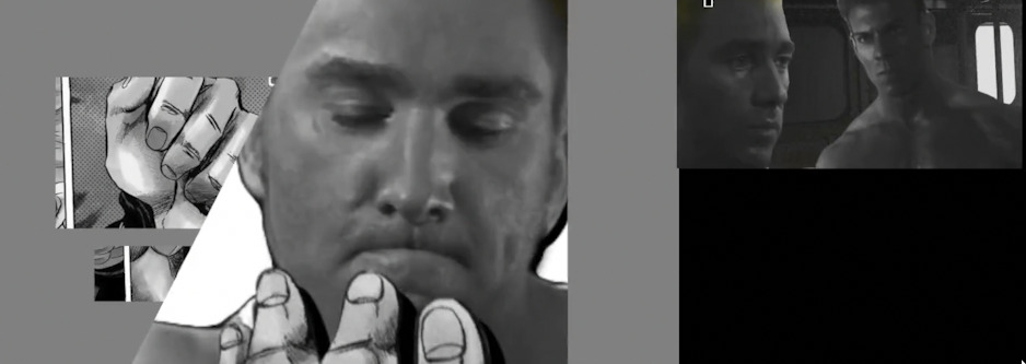
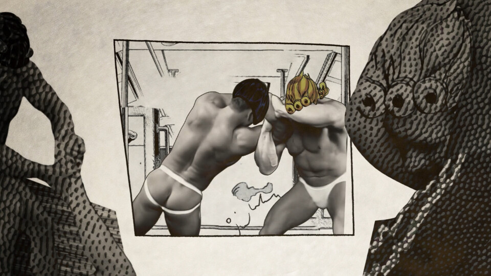
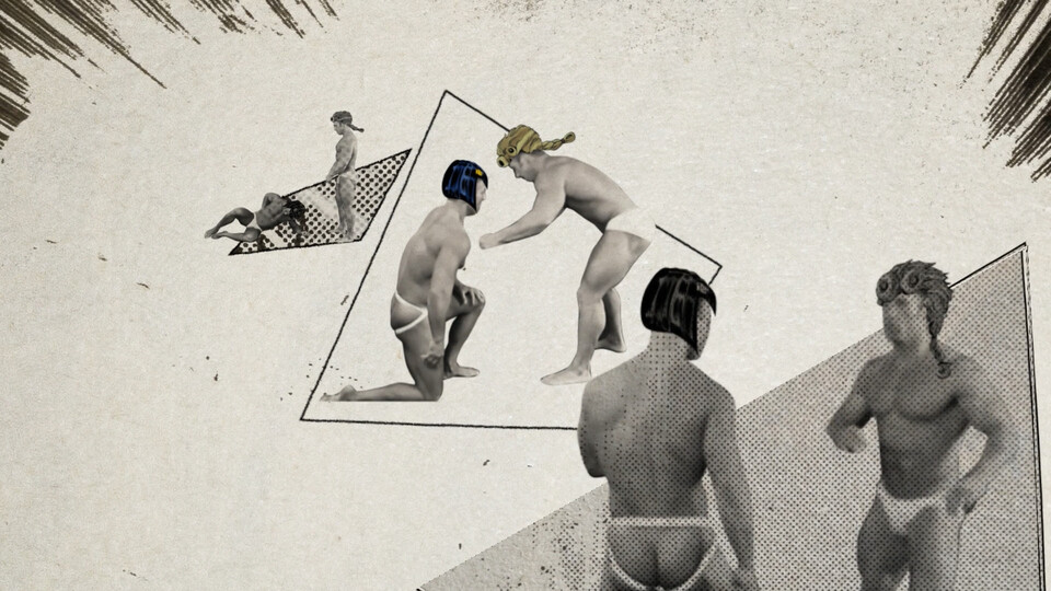
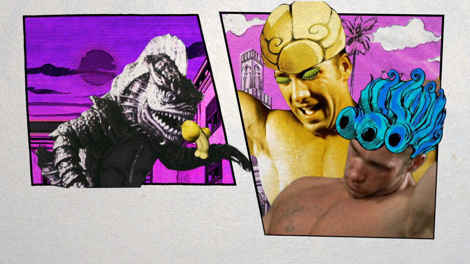
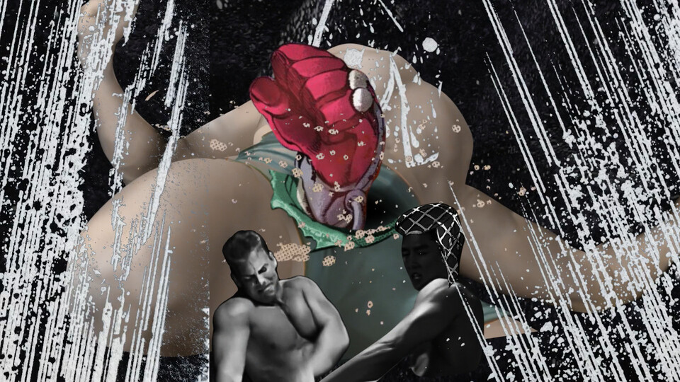
As you can see from the two shots in the top left I was still very much in my TPOT mindset starting out on this, wanting the reader to see Aniki, him opening his hand, the chinpo, and Kazuya within the span of under two seconds. I even tried to bring in a 3D environment with a train and crazy flashing lights! You can see the idea of panels and their manipulation start to take shape in the back of my mind on the top left, though. Eventually I refined the framing, cut the chinpo from the main read altogether, and just focused on the read of Aniki and Kazuya’s face.

Note how I push Billy to the left when Kazuya appears so Kazuya’s in the same spot Billy was. I found that when I didn’t do this and instead kept Kazuya to the right, there’d be more of a delay noticing him (even though I’m using one of Kazuya’s most recognizable images), making the lick animation8 feel jarring. This is an example of being aware of how you “lead the eye,” which I achieve for the most part by just keeping the main element in the center of the screen. It’s a strategy that’s kinda unavoidable in fast-paced parts like this.

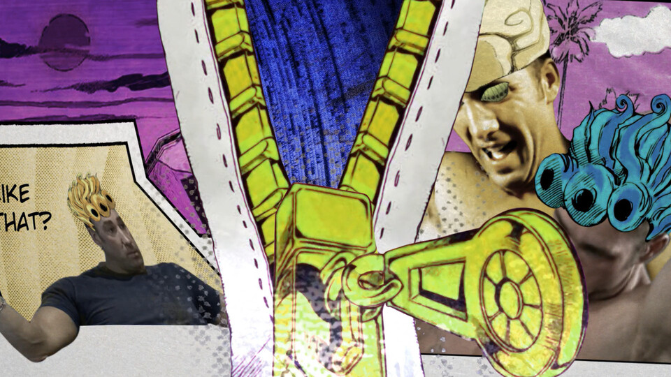
These next three shots are probably the muddiest parse-wise in the piece. I probably should’ve changed the sentencing, cut out the first shots, and just make this part about Aniki ripping the arm zipper and throwing it at Kazuya, but I decided to roll with what I had. Notice how I constantly change the size of whatever’s in the middle of the frame between shots to keep things slightly more interesting to watch. Also shoutout to Grunku and Noah for guidance on the zipper punch.

These two shots are also kinda weak. At least the inner transition matches with the sentencing. I try to show a more manga-esque way of communicating the passage of time in the second shot, where it cycles between panels instead of employing animation. Looking back I should’ve made the secondary elements way darker to bring the attention onto the center. It’s actually a bit easier to tell what’s going on in the simpler composition I had before, at least from my perspective.
This next bit is definitely my personal favorite sequence of the part.


Recall that up until this point the panels have functioned, for the most part, like how you’d expect them: they sit still and display whatever’s inside of them. Occasionally I’ll animate the panels popping onto the screen or sliding, but nothing crazy has happened. All of a sudden, these three panels with Makaay are undulating wildly in shape, line weight, and scale as an unknown voice screams into his ear! There seems to be a strong foe around the corner that’s controlling not just Makaay but the nature of the panels themselves, and he’s known as the…
He silences and shrinkens the two dissonant panels, destroying all but the bottom line of the borders, and we enter the free-flowing, inky black world of his Stand. I originally wanted to signal that Van is controlling Makaay by putting Van’s eyes on Makaay (which become an important tool later), but I think these chaotic panels work a lot better. To keep the print manga feel I don’t go too dark in the blacks, except in the center to make Van’s face pop out more.9
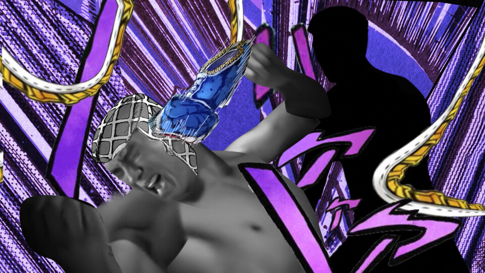
This van shot is also unique in that he’s the first one shown speaking. The exaggerated mouth movements in these three lines are the product of me time remapping a bunch of unrelated mouth movements until I got something that looked right, which was extremely satisfying to make. If you listen verrry closely you’ll notice there’s also a hidden syllable between Fisting and Artist, (’m an) which I properly account for in the lipsync. Probably some crazy complicated rhythmic structure laws at play here (or it just sounds good).


I’d argue that the “Change my whole n’tire…” line is the most creative vocal in the entire part, even more than the upcoming Gay Mafia line. It perfectly encapsulates the connotation Terrio wanted to make (showing Van’s mafia influence expanding) without requiring any syllables to be added or removed, on top of being a unique yet recognizable pick. Originally I depicted Van’s “influence” as clips from Kink.com floating around him, then to the Kink building rising to the sky with a map of Italy and Kink logos, but these all felt not very readable. So I went for the biggest object I could, the entire world.10 I don’t know why exactly I picked blue instead of red for the accent color; it just didn’t fit when it was red. Maybe it was to highlight the “coolness” after the storm, maybe it was to contrast the blue with the slight red in next shot’s flame.
It actually was pretty late into the project before I realized I could wrap the SUCKTION! speech bubble, Makaay, and Van’s hand representing the cell phone all into one idea and make him actually hold the speech bubble. This and a lot of the other “discoveries” I made along the way (the composition of the panels in the first Aniki shot, the subtle white lines and blue stripe in the Fisting artist shot, the zipper texture in the “get the hell outta here” shot to name a few) formed when I took all the frames into Photoshop and spent some hours just arranging the shapes and trying new compositions and textures. It’s so much easier to iterate and play around in a program like it than it is After Effects, and I highly recommend people look into motion design storyboarding (see Division05 in Recommended Contents).

I break away from timing the visuals to the sentencing here and use a slow dolly on Z for the first time to lower the energy a bit and build suspense. Notice how the flame achieves three purposes: it references Polpo’s lighter test in the manga,11 it’s used as symbolism to show Van’s eventual defeat (which was also intended by Terrio if you look in the OG storyboard), and the action of it going out directly causes the Gay Mafia shot to happen.
I was planning on rolling with that stock footage flame in the roughs until I flicked my wrist a certain way with a paper towel and ink and made this mark. I also dialed back the scale of Aniki and Bo’s reaction so that the flame going out becomes the focus, because it’s the more important element.


Ah yes, the drop. I pulled off some fake 3D depth here in a combination of timing the moat monster and ass rotoscopes while animating the scale of the stick. The background is a collage of two nice-looking ink stains I made, which I think I also did with a paper towel. I would’ve written out the text since the line is so important, but I couldn’t figure out how to balance it in the composition. Note how the impact changes drastically when the arrow is smaller than the moat monster’s head.
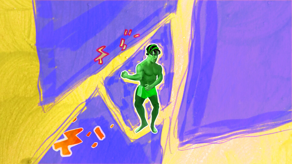
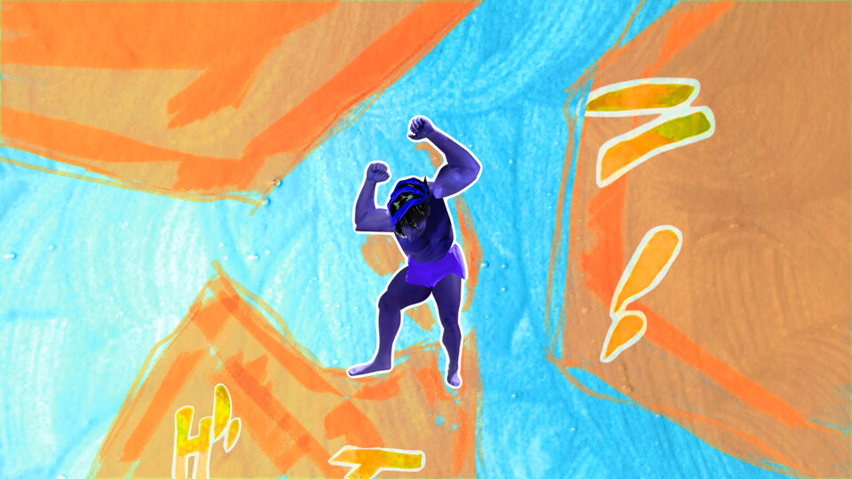
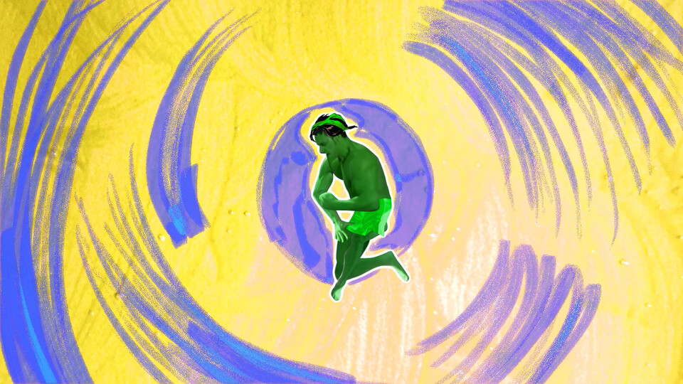
Now that we’re in the “main story” the style gets shifted from “traditional manga” to how us readers are usually accustomed to reading the stuff: swiping through the pages on a blue-tinted LCD in full color if available. Obviously I went for the wacky color schemes Araki is known for.
This zipper reminded me of an important thing I learned throughout the project: drawing is an insanely valuable skill to have! I had to spend so long flipping through every page in the manga and masking out zippers, hair, speech bubbles, objects, backgrounds… it’d be so much more cohesive and easy if I could just put pen to paper and crank out the illustrations myself. At the same time I’m not gonna have the drive to practice drawing random objects, so I either have to attempt it in real projects and accept the long-term suckage, or keep relying on other people’s work. But back to the commentary, I was reminded because I didn’t like how my first zipper animation looked, so I redid it with a more defined one I found later in the project.
I’m kinda breaking my earlier rule of “not emphasizing the paper” here by suggesting Kazuya’s zipper is going through the pages of the physical book into a new chapter, but it makes for a cool idea and transition. That texture on the zipper insides is from some of my manga copies where the ink bleeds onto the edge of the paper.
This shot was also pretty burdensome technically. I had to do a whole bunch of precomping, masking, pickwhipping expressions to make a fake puppet pin layer for the distortion of the background… (which I might’ve just replaced with a gradient displacement map). Kazuya’s head sticking out is also a cheat; it’s just a separate layer on top.12

Note how I animate them walking on the little ‘fuc- fuc-’ to fit the “get the hell outta here” line from before and suggest they’re going to a new location. I meant to switch out these screencaps from the anime with panels from the manga but forgot, lol. I guess I’m also displaying a new camera technique here too– rotating slightly. I wish I could’ve done something more with the gang besides just revealing them for the gag of who’s who.13
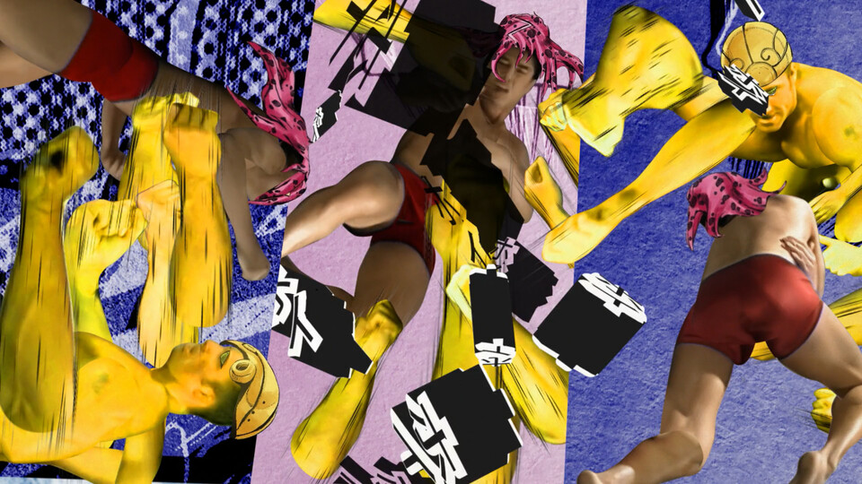
Now THIS shot took the longest time to develop. I was fixated for a while on trying to convey a sense of transportation as the gang travels to Diavolo, but I ended up just abstracting the panels into blocks of color and hand-animating them wildly like in Van’s intro, with the colors referencing the anime torture dance. I wanted it to look different from everything else, so I used some gouache rather than ink for the textures. The matte hacks I did to separate the two hue adjustment layers from Biolante and the background weren’t pretty.
The torture dance itself is a showing of an “advanced” kind of puppeteering, where multiple different poses from different points in the original video are mashed together into one motion. Gachi is definitely the most untapped source when it comes to this just from the sheer variety of angles and poses these guys can be seen in over the hours of content there is. Seraphim was only the beginning!
I got kinda lucky with how the dance turned out, as the shot where he pounds the locker and turns around in the beginning of Lords of the Lockerroom already gave me half the dance. It just takes a lot of careful observation (and even watching of the footage upside-down when they’re on the ground) to find just the right angle of the body. A tip I’ve learned is to not let occlusion disturb you; Bio’s neck when he bops his head up was actually choked by Van’s arm in the original, but in motion the content-aware fill isn’t that noticeable.
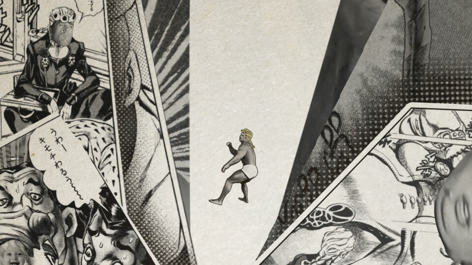
I also briefly showcase an important Jojo-related element I’ve been slacking on throughout the video: the sound effect bubbles. I had masked out a bunch more but held back on adding them throughout because I feared they’d feel overused, but admittedly I should’ve used them more.

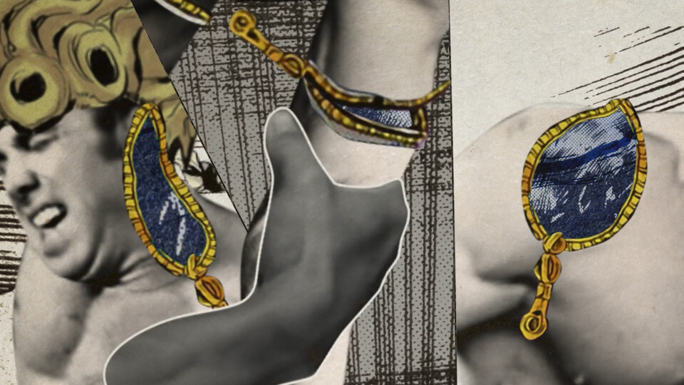
This is a bit of a stretch, but Diavolo’s main means of communication is a laptop, and in the times the screen is shown the windows look a bit like the classic Mac OS. Also I get to be a bit clever with this Van shot from the Kink interview.
Around here, as you can probably tell, is where the part loses its polish. I was probably pushing past the 500 hour mark as I increasingly placed the collab higher and higher in my mind and neglected everything else, so in early December I handed in my part and just left.14 There wasn’t any management issues or drama or anything; 15 it was something I brought onto myself.
I’d be lying though, if I didn’t say this next sequence is what made it all worth it, even in its unpolished state.

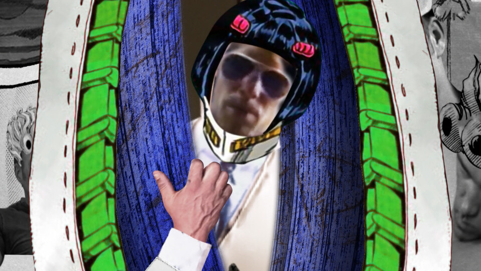
We’re greeted with the black-and-white world of Van’s stand along with a full view of his face for the first time, and Kazuya is presented with a choice: fight or flight. This is also the only “rule of thirds” composition I use. Instead of the usual swipe or scale-in transition I try to catch the viewer by surprise and hard cut into the next shot.

My original idea of ‘upping the ante’ of this sequence was to do a bunch of stuff in 3D, as you can see in the rocks, but as the part progressed, I thought it would be more cohesive (and less time-consuming) to bring everything back into After Effects. Looking back at this shot I should’ve done something to change up the background other than inverting the color of the borders, because it doesn’t feel as impactful as I had it before. I should’ve kept my original idea of having a large foreground that breaks away.

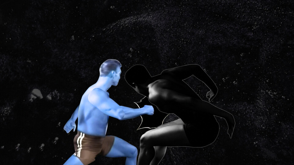
The torture dance might have taken the longest to develop the idea for, but this shot took the longest time overall. I probably redid the Van puppeteering and the entire camera 4-6 times. I originally wanted to do one continuous shot where the camera does a 180 to follow the fist as it smashes into Van, but I realized I couldn’t be spending 6+ frames between the two shots when they already happen so fast, so I replaced it with a cut. I thought I had to use 3D to get the crazy rotation of the fist exactly how I wanted, but wasn’t until I hand drew how I wanted the fist to look as a simple box did I get something I was happy with. I ended up tracing a fist from the manga on top of it to give it that hand-drawn look. I also put together each frame of the two backgrounds by hand to make sure it matched the animation well.
There’s not much to talk about here other than finally satisfying a primal urge I’ve had to make something like Bayolante or a gGradest video I don’t remember how exactly I came up with the idea for the Sticky Fingers / Bucciarati tag team; probably just took a lot of experimenting and flipping through the source footage.

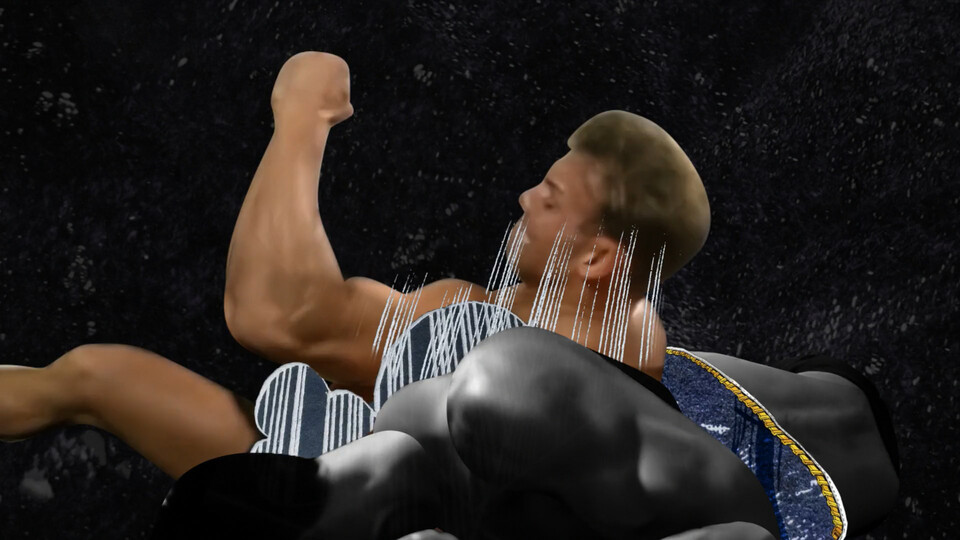
This shot is probably the biggest example of sacrificing the rhythm of the music for readability. I originally had a completely different shot of Van punching Kazuya quickly from the side to go with the two previous flurry of blows, but it just wasn’t legible at full speed. I had to do a slower windup and one punch, so the only way I could raise the tension higher was to use a “graphic” closeup like this. Which I kinda rushed, but at least it turned out somewhat goofy.
There was something about the bullet transition in this shot that felt stiff when I initially made it, and before going back to the drawing board, I moved around the Ikeda panel I left static in the center of the screen for some reason (maybe to show he’s “controlling” the tide of battle or something?) and it instantly became 3x as chaotic. Don’t be afraid to make big moves!
I actually did the initial animation for this all pretty early on in a single day over the span of 7-8 hours; probably the most productive day of my life. The key was to put all the fists in a single layer that you time remap with a random expression, and then hand animating the rotation and position to art direct it.

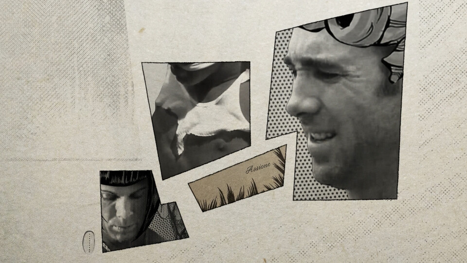
If I had the willpower to add Diavolo’s hair to all of the Van shots I probably would’ve made it fall off on the “SHIT!” line here to hint at how the big, bad foe we thought was the mafia boss Diavolo just turned out to be a rando named Van with a wig on. It’s kinda a meta jab at the “adding hats to make X character play Y” trope that’s inevitable in these types of song choices. The choice to darken his eyes was influenced by this logic.
Finally I call back to Van’s intro shot with this image of Billy I had to spend quite some time digging to find. Looks much better than the seat belt one I had, doesn’t it?
Closing Thoughts
As I hope this post has demonstrated, knowing the tools is only part of the equation of what it takes to create imagery that’s engaging. Constantly being aware of how you can wield the principles of design to create contrasts between the elements and suggest something to your audience is a much more important skill that takes a longer time to master; I’m still very much a rookie. If you want to learn more about these concepts, here are the materials that have greatly influenced my thinking these past two years:
Recommended Contents
-
Directing the Story by Francis Glebas A great book on storyboarding
-
Division05 An underrated channel discussing purpose and motion design storyboarding
-
自己矛盾のメタル化HSI演出解説 A 3.5 hr audio commentary of a BB劇場 video discussing the medium and how it plays into shot composition (for the nihongobros)
-
Understanding Comics by Scott McCloud A great meta dive into the medium of comics through a comic book
-
My favorite IWF part for the longest time was the Nichijou one… ↩︎
-
I know; I’m learning some low-level C and this makes me cringe profusely too. But it’s a good example. Also “80s grainy gradients with epic soul retro synth sound design” should be the new mograph trope meme. ↩︎
-
I’ve listened to this section literally between one and two thousand times, and even though there were times where I became detached from it, I can still listen to it today and feel the impacts just as well as the first. ↩︎
-
It’s weird how high DPI scans of popular manga are rare to see, but raw Blu-ray dumps are common. This might be a ’touch grass’ moment, but I was surprised at just how much more detail there is in the physical pages than the digital releases upon comparison. Every time I see a manga AMV now I can’t help but think “dude, you could’ve at least bought the print and saved us the eyesore of your 500px waifu2x upscale crosshatching.” Well, I guess I shouldn’t be the one saying that, because I only had part 3 and had to do the same thing for the hats of everyone. :kzylaugh: ↩︎
-
I’m happy that Terrio brought out those initial percs in the master; originally they were pretty quiet and lessened the impact of this transition. Also I didn’t realize this when I made it, but this opening shot is a bit similar to the beginning of the (GTA part)[https://www.youtube.com/watch?v=JowZCGfK07c] in IWF 2017. It’s a crime it got obscured by the explosion from the previous part in the full collab. ↩︎
-
哲学コーナー: The distortion of the sentencing in this part also functions as a slight divorce from the concept of sound, representing a state closer to the soundless experience of manga. ↩︎
-
A lot of subtle tweaks in timing of the zoom in and lick were also needed to get it to look good. Shoutout to the person that opened this rat’s nest of a project file and actually had the drive to clean up this and the other messes I refused to fix. ↩︎
-
If there were one thing in the entire part I could go back and fix it’d be the seam at the bottom of his chin; normally I’m a bit of an アホ and let the edges of my BBs hang out raw, but this one is actually distracting and would increase the shot’s impact so much if I patched it. ↩︎
-
There’s this Kink.com source of Van waving his arms in the air that the (Barbie Van)[https://youtu.be/IRYo-9duYDY?t=20] IWF part uses to convey a similar concept (it wouldn’t fit the tone I wanted to go for), and I’m so angry that they didn’t make it more of a spotlight in the composition! It’s such a good pick! ↩︎
-
Giorno has to keep the flame of a lighter lit for 24 hours, and if it goes out, Polpo’s stand (the moat monster) activates and tries to stab him with the arrow. ↩︎
-
If you look closely his head also choppily bops down as he pulls back and the camera pans in. When I tried taking it out it didn’t feel right; it’s like he’s taking a step back. ↩︎
-
If I had played my cards right I could’ve made the setting the boat and put them in the torture dance (also allowing for a better transition), but I had already burnt myself out before the idea was suggested to me. Ironically the torture dance itself was one of the first things I made, being finished around a week or two into the project. ↩︎
-
What I gave them was pretty much what the final is. They actually went in and made some additions (the zipper from Kazuya’s fist, patching some BBs, some color correcting) which surprised me, given how busy their plates probably already were with the other parts and how time consuming it must’ve been going through my crow’s nest project files. ↩︎
-
I’m surprised Mowtendoo had the resolve to finish 2017. ↩︎